
One of the things I most enjoy about the corners of Twitter that I frequent is seeing the amazing data visualisations people create. It can be a powerful tool to inform and tell stories through data. This is a topic I have long been interested in, so I decided that with the 2021/22 season rapidly approaching, it was time for me to put my half-forgotten R skills to good use and get involved.
I also decided that it may help others if I shared my process, as a starting point for those looking to produce football/FPL related data visualisations.
0. Prerequisites
This tutorial assumes that you have a working instance of R set up on your machine, and it would also be helpful to have a basic familiarity with the syntax of R. If that sentence confused you, here are some resources I would suggest checking out:
I use the RStudio IDE to write and execute R code, which I would strongly recommend for beginners.
1. Data Preparation
Before we can make a chart, we need to load the data we want to visualise into the R environment. For this tutorial, we will use data from FBRef.com, which is a brilliant resource which is powered by StatsBomb data. StatsBomb is considered by many in the field of analytics to be the most powerful and accurate underlying data available.
There are a few ways you can fetch this data in a programmatic way, and I would recommend reading this great tutorial for more information on this, however for the purposes of this tutorial I am going to manually save the data we need as a CSV on my machine.
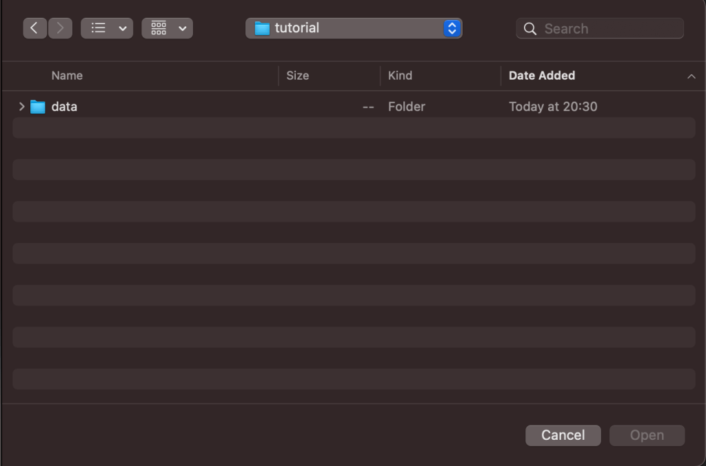
First, let’s start by making a folder to store the code we’re going to write called tutorial. This can be created anywhere on your machine. Let’s make another folder called /data inside this folder where we’ll save our CSV.
Next, go to FBRef and find the Premier League stats page for the 2020/21 season. For this tutorial, we’ll use the ‘Player Standard Stats’ which shows the performance data for all players in the league.
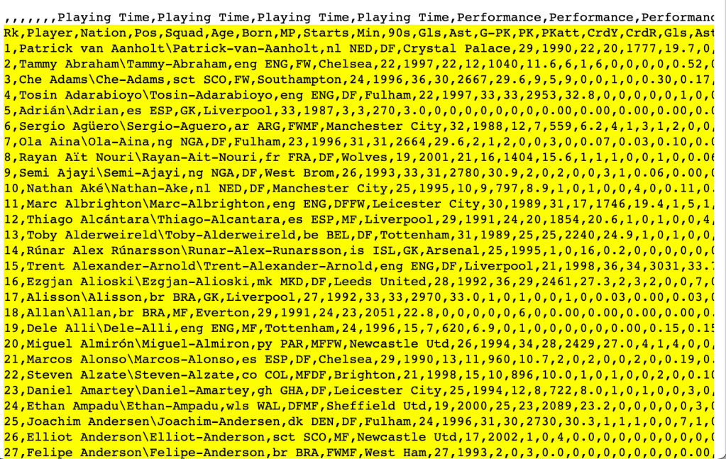
Find the ‘Squad Standard Stats’ table, and click View Player Stats to show the stats for all of the players. Next, click Share & Export -> Get table as CSV (for Excel), which will convert the table into a CSV format.
Open RStudio, and create a new file in your RStudio editor, then copy the contents of this table and paste it into your new file (Important: Do NOT copy the first line of the CSV as it will cause issues with column names! Make sure to start on the second row, as shown in the screenshot above). Then, in RStudio click File -> Save As.. and save this file as tutorial.csv inside the /data folder we made earlier.
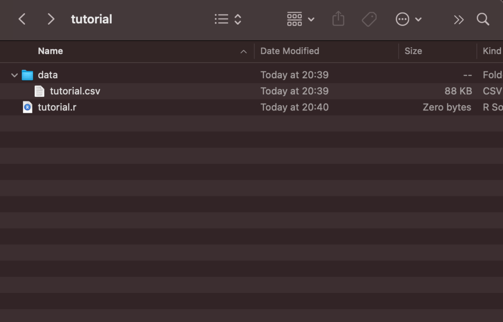
Now, we have everything we need to import the data into R. Make a new file in RStudio called tutorial.r, and save it in the /tutorial folder. At this point, the folder should contain the following files:
Now, we need to install a few packages to help us process and visualise the data. A package is a bundle of reusable code that has been created to help make other programmer’s lives easier. As an example, rather than each person who needs to create a chart reinventing the wheel and writing code from scratch, we can use packages to help us, adjusting the things we need for our unique use case.
Run the following command in the R Console to install the packages we require for this tutorial to your machine (I’ll discuss their purpose in more detail later):
install.packages( c("rstudioapi", "stringr", "dplyr", "tidyr", "ggplot2", "ggtext", "ggrepel", "ggthemes", "lubridate" ) )
This command may take a while to run. Once it is finished, add the following lines to our R Script to import these packages, which will allow us to use the functionality they provide:
# Import the libraries/packages we require:
library(rstudioapi)
library(stringr)
library(dplyr)
library(tidyr)
library(ggplot2)
library(ggtext)
library(ggrepel)
library(ggthemes)
library(lubridate)
Next, we need to import the CSV data we saved earlier into R, and store it as a DataFrame. DataFrames are a data structure which allow us to easily transform and manipulate data. They can feel quite alien at first to those unfamiliar with R, but are very powerful. We don’t need to know what is happening behind the scenes for this tutorial, but more information can be found here for those interested.
Now, let’s import the CSV data:
# Make sure that our R script is using the directory the script is being run from as the working directory:
current_path = rstudioapi::getActiveDocumentContext()$path
setwd(dirname(current_path ))

# Read the player data CSV and store it as a dataframe inside a variable called `df`:
df = read.csv(file = "./data/tutorial.csv' )
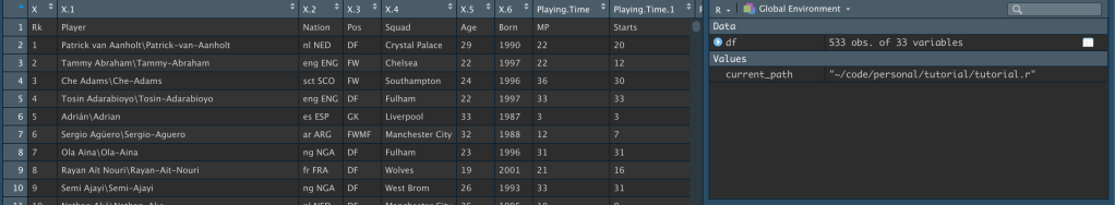
The data should now be stored inside a variable called df. We should be able to see it in our environment tab in RStudio:
Now, this data has a few problems. Luckily, we can clean it up and process it using the dplyr package, which is an invaluable package which makes data processing much easier. Firstly, a few of the column names are pretty confusing because of the way they were named in the original CSV file. We can fix that using the rename function:
# Transform column names:
df = df %>%
  rename(
    npxG_p90 = npxG.1,
    xA_p90 = xA.1,
    npxG_xA_p90 = npxG.xA.1,
    g_p90 = Gls.1,
    a_p90 = Ast.1,
    npG_p90 = G.PK.1,
    npG_a_p90 = G.A.PK
  )
This will replace the column name on the right-hand side with the one on the left, meaning the confusingly named npxG.1 becomes the much clearer npxG_p90.
Secondly, FBRef displays the player name in Firstname Lastnamè\Firstname-Lastname format, which is definitely not ideal if we want to show player names in our chart. We also have every player in the Premier League in this table, which we may or may not want depending on what we want to do with our data. If we wanted to show npxG vs. goals in a scatter plot, for example, it would be pretty impossible to show this for all 533 players in a readable way.
Let’s process our data to fix the player names, and then filter our data to find the players who played more than 500 minutes, a filter to only display players who play in either midfield or forward positions, and a threshold of 0.05 npxG per 90 minutes, to eliminate players who just aren’t focused on shooting. This will ensure we use a subset of our overall data containing only the players who were threatening on a regular basis last season, and played enough minutes to avoid the issues that come with small sample sizes.
df = df %>%
  separate( Player, c( "Player1", "Player2" ), "\\\\" ) %>%
  filter( Min > 500 & (Pos == "FW" | Pos == "MD" ) & npxG_p90 > 0.05)
This should leave us with the a much smaller dataframe. I can use the head(df) command in my R console to inspect the first few rows of our dataframe:

head(df) command.At this point, we’ve imported our data into R, stored it in a variable, and processed it to make it easier to work with to produce our chart.
2. Creating our Data Visualisation
To create our data visualisation, we will use the ggplot2 package. ggplot2 is a package which provides a grammar to declaratively create graphics using a defined set of data. In layman’s terms, we tell it what type of graphic we want to create and how we want it to look, and it handles the details. ggplot code looks confusing at first, but it starts to feel more familiar after a bit of practice.
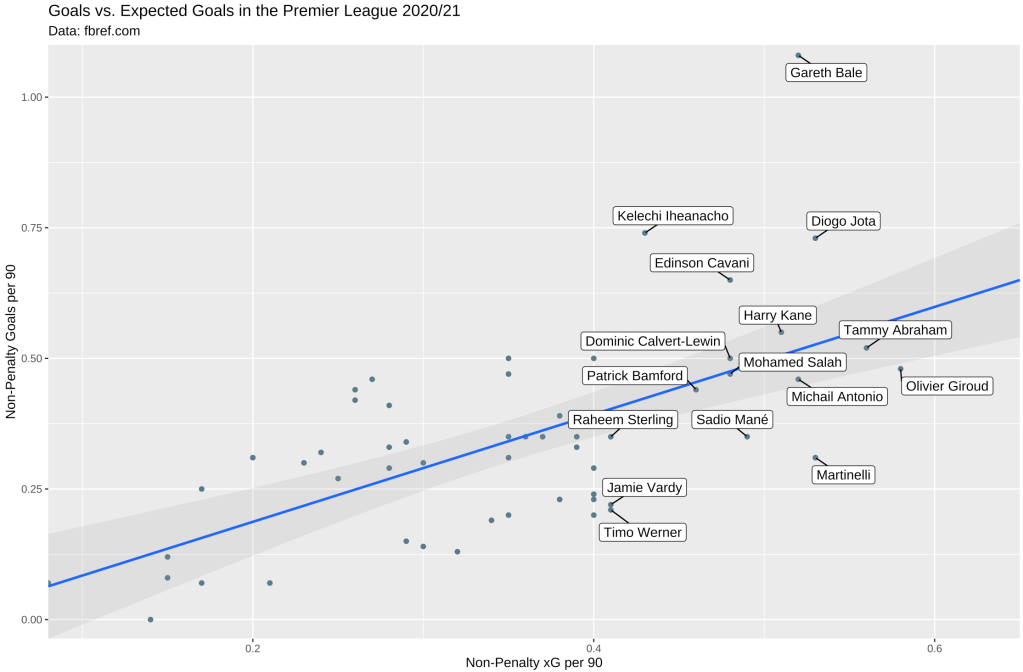
This is the final chart we will end up with, displaying the relationship between non-penalty goals and xG for players who played more than 500 minutes:
To start with, we need to draw a canvas, and add our points to it. In our chart, the x-axis will represent non-penalty xG per 90 minutes, and the y-axis non-penalty goals per 90 minutes. We can do that with the following code:
ggplot(df, aes(x=npxG_p90, y=npG_p90) ) +
  geom_point() # Show dots
In just two lines of code, we’ve already been able to draw a chart. All we’ve needed to do is call the ggplot function and provide it with the data frame to use, and use the aes function to provide an aesthetic mapping, telling ggplot what column in df to use to represent our x and y axes. We then chain this with a call to geom_point(), to tell ggplot that we want to draw a scatterplot using the provided data:
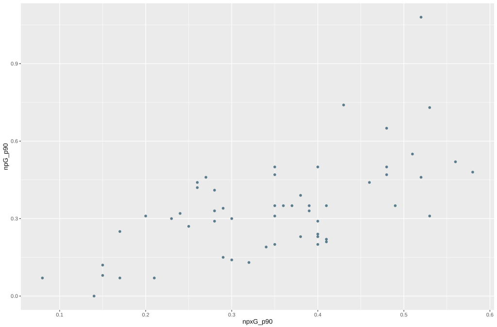
Unfortunately, it’s not very good. It doesn’t tell us anything. Who is represented by the dots, and what is the relationship between the x and y axis? Is there a correlation between them? The labels are also vague, to someone who doesn’t know what they are looking at.
Let’s add some code to add labels to the chart. Because there are so many players here, it would get messy if we tried to label all of them. Labels would clash and overlap. There are two ways we can mitigate this. One is by only showing labels for players who are particularly interesting to us. In this case, I am interested in knowing who the best performers in terms of their underlying metrics were. The other way we can fix this is by using the ggrepel library. Normally, we’d use either the geom_text() or geom_label() functions to add labels to our chart. ggrepel implements its own version of these functions, but with additional algorithms to prevent text from overlapping. We can do all of this as follows:
ggplot(df, aes(x=npxG_p90, y=npG_p90) ) +
  geom_point() +   # Show dots
  geom_label_repel( aes(label=ifelse(npxG_p90>0.4, as.character(Player1), '')), box.padding = unit(0.40, 'lines'), min.segment.length = unit(0, 'lines')) # Add labels
There’s a lot going on inside that geom_label_repel function. Essentially, we are telling it that we want to use the column Player1 as our label, but only if the npxG_p90 value for that particular column is greater than 0.4. The box.padding and min.segment.length arguments are just to make sure the labels display nicely, and can be tweaked with trial and error. By running that, we should get the following:
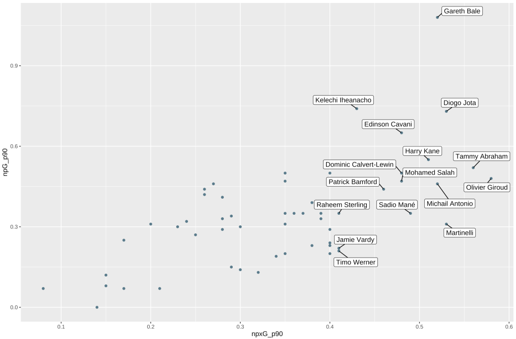
This is a bit better! We can now see which players had noteworthy underlying stats last year. However, it’s still unclear what the relationship between xG and actual goals was. We can use the geom_smooth() function to draw a smoothing line, to help us understand the trends in our dataset better.
geom_smooth() requires us to provide the method of smoothing we want to use. I am by no means a statistical expert, so please feel free to correct me on this, but I chose to use lm to fit a linear regression here. The different methods available are documented here. I have also added a 25% confidence band, to show which players over/underperformed their xG within a ‘normal’ range (this is also known as the Messi rule):
This is what our code looks like at this point:
ggplot(df, aes(x=npxG_p90, y=npG_p90) ) +
  geom_point() +   # Show dots
  geom_smooth( method = "lm", alpha = 0.25, fullrange = TRUE) +
  geom_label_repel( aes(label=ifelse(npxG_p90>0.4, as.character(Player1), '')), box.padding = unit(0.40, 'lines'), min.segment.length = unit(0, 'lines'))
And here’s our chart:
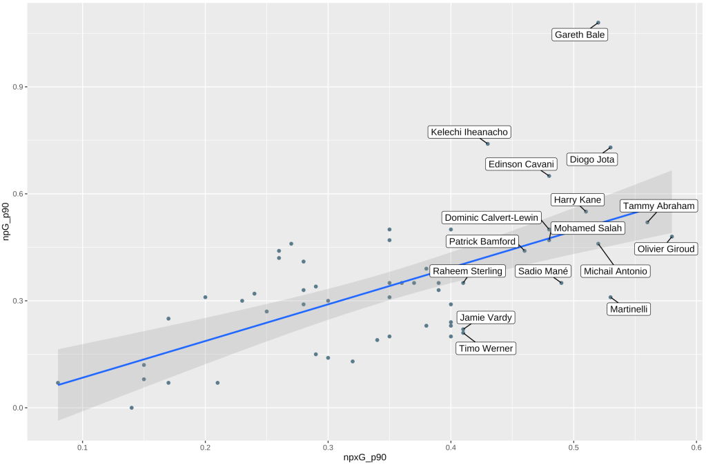
Now that’s more like it! There are a few more little things to tidy up before we’re done. Because of the confidence intervals on the line of best fit we added with geom_smooth, our y axes is starting below 0. We can use the x_scale_continuous and y_scale_continuous functions to set sensible limits on our chart , and use the labs function to add labels to our chart, so that we can add additional context to help viewers understand what they are looking at. Putting all of that together, our code will now look like this:
ggplot(df, aes(x=npxG_p90, y=npG_p90) ) +
  geom_point() +   # Show dots
  geom_smooth( method = "lm", alpha = 0.25, fullrange = TRUE) +
  geom_label_repel( aes(label=ifelse(npxG_p90>0.4, as.character(Player1), '')), box.padding = unit(0.40, 'lines'), min.segment.length = unit(0, 'lines')) +
  scale_color_gradient(low="lightgrey", high="black") +
  scale_y_continuous(expand=c(0,0), limits=c(NA, 1.1)) +
  scale_x_continuous(expand=c(0,0), limits=c(NA, 0.65)) +
  labs(
    x = "Non-Penalty xG per 90",
    y = "Non-Penalty Goals per 90",
    title = "Goals vs. Expected Goals in the Premier League 2020/21",
    subtitle = "Data: fbref.com"
  )
Note that we need to add a title, subtitle, x label, and y label to labs(). Let’s run that and see what the chart looks like:

Voilà! We were able to successfully create the chart! Here’s the full code we used to do all of that:
# Import the libraries/packages we require:
library(rstudioapi)
library(stringr)
library(dplyr)
library(tidyr)
library(ggplot2)
library(ggtext)
library(ggrepel)
library(ggthemes)
library(lubridate)

current_path = rstudioapi::getActiveDocumentContext()$path
setwd(dirname(current_path ))

# Read the player data CSV and store it as a dataframe inside a variable called `df`:
df = read.csv(file = './data/tutorial.csv' )

# Transform column names
df = df %>%
  rename(
    npxG_p90 = npxG.1,
    xA_p90 = xA.1,
    npxG_xA_p90 = npxG.xA.1,
    g_p90 = Gls.1,
    a_p90 = Ast.1,
    npG_p90 = G.PK.1,
    npG_a_p90 = G.A.PK
)

# Split the player name column into two columns on the '\' character, then filter our dataframe to only show players who had more than 0.4 npxG per 90 and played at least 500 minutes:
df = df %>%
  separate( Player, c( "Player1", "Player2" ), "\\\\" ) %>%
  filter( Min > 500 & (Pos == "FW" | Pos == "MD" ) & npxG_p90 > 0.05)

# Draw our plot:
ggplot(df, aes(x=npxG_p90, y=npG_p90) ) +
  geom_point() +   # Show dots
  geom_smooth( method = "lm", alpha = 0.25, fullrange = TRUE) +
  geom_label_repel( aes(label=ifelse(npxG_p90>0.4, as.character(Player1), '')), box.padding = unit(0.40, 'lines'), min.segment.length = unit(0, 'lines')) +
  scale_color_gradient(low="lightgrey", high="black") +
  scale_y_continuous(expand=c(0,0), limits=c(NA, 1.1)) +
  scale_x_continuous(expand=c(0,0), limits=c(NA, 0.65)) +
  labs(
    x ="Non-Penalty xG per 90",
    y="Non-Penalty Goals per 90",
    title="Goals vs. Expected Goals in the Premier League 2020/21",
    subtitle="Data: fbref.com"
  )
3. What Next?
Hopefully this tutorial serves as an example of the process of making a chart. This in itself is pretty powerful. We could change the data we used, for example using vaastav’s CSV’s containing FPL API data instead of the FBRef data. We could change a few of the parameters, for example perhaps exploring team xG/xGA to represent team strength. We could draw different types of charts, perhaps something inspired by one of the many visualisations that ggplot provides. Another thing we can do is explore different ways of styling charts, for example using the ggthemes package. The possibilities are pretty much endless here, and this is just a starting point!
If you have any questions, please feel free to ask me on Twitter. Thanks for reading!
